

Nautica
Rewards LP Design
My Roles: Web Design | UI/UX | Production | Research
Research and Identify Issues
Review and understand the brand and customer journey.
Comparative analysis between competitors and our brand.
Coded in plain HTML text
4. Lacking hierarchy in typography and message.
5. Lacking in color and images
6. Hyperlinks as the call to action
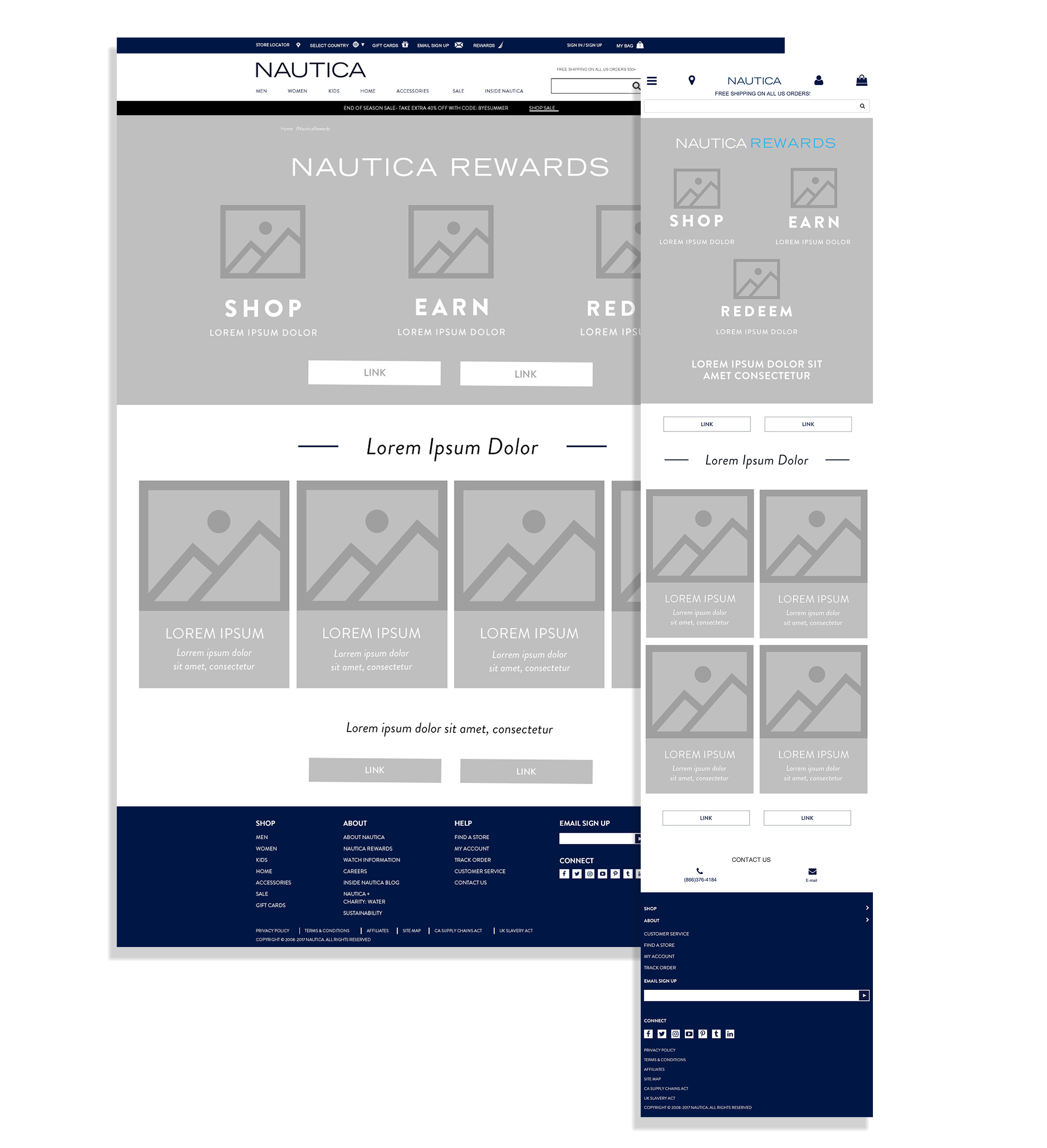
Creating the Wireframes
for mobile & Desktop
Designing
the
look
and feel
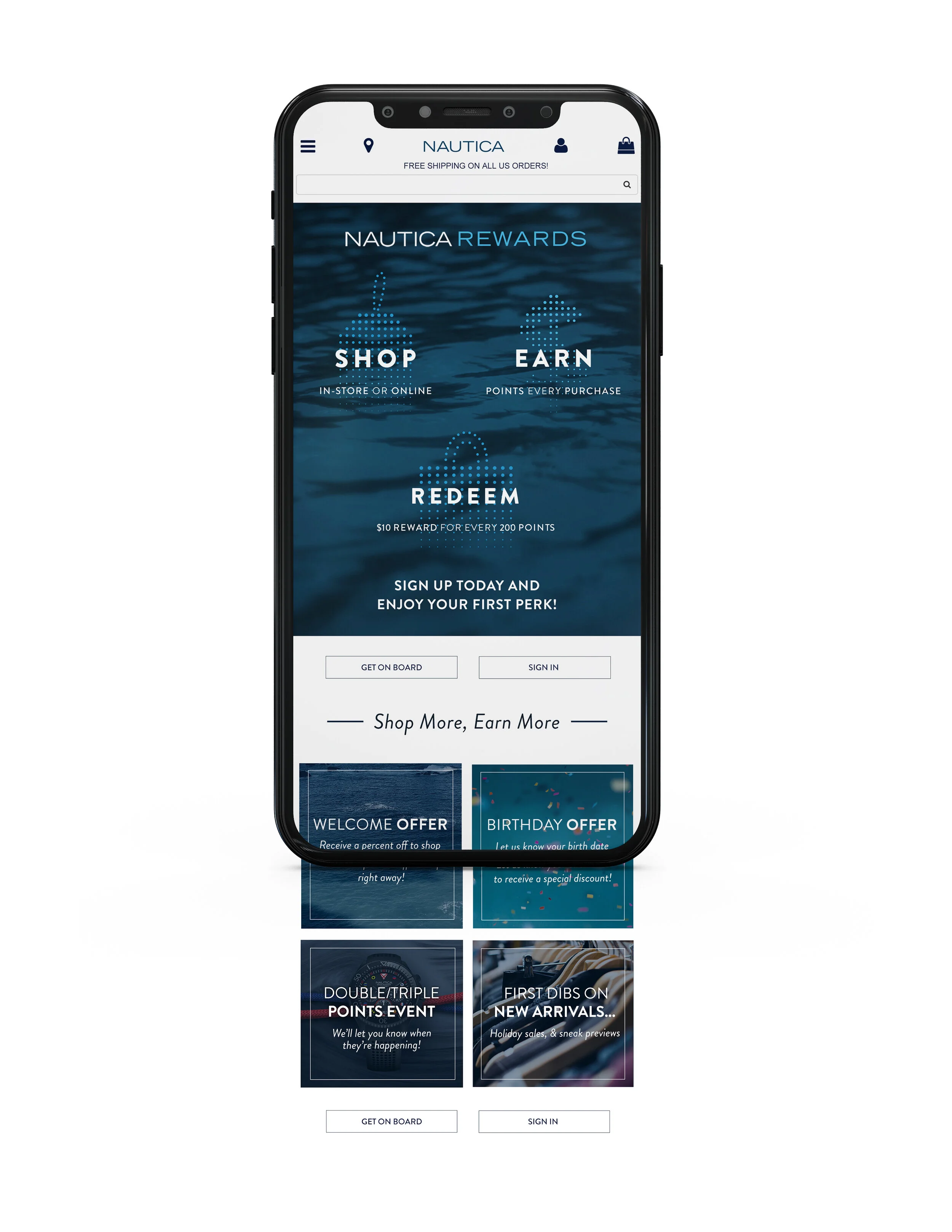
Main Message:
To add hierarchy, we added the title of our web page and the key message on how our rewards system works to our customers below the title. In addition, we added a background image to the header, icons for each key message and color to take up more of the page.
Buttons and Links:
We replaced the hyperlinks with buttons which makes them easier to find. The buttons are also added at the end of our page so the customer does not have to scroll back up to find the first set of buttons. The button, once clicked, will take the customer to a sign up page if they don’t have a rewards account with us or takes them to log in and review their points and rewards
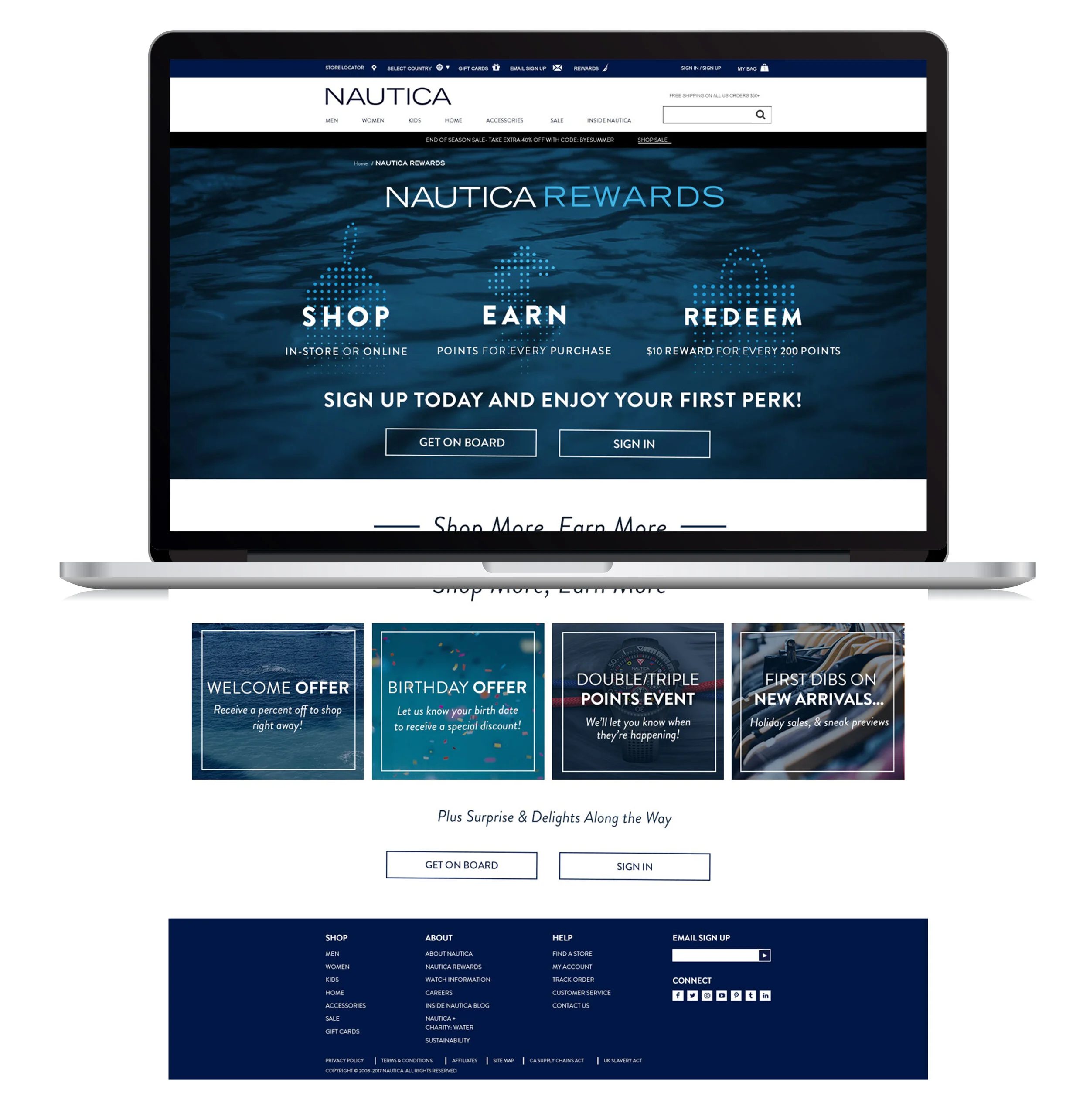
Supporting Information:
To go more in depth on our rewards program, information on perks that our customers can receive is added. Without overwhelming the customer and the design of the webpage, we kept this short and to the point. Images is added to each perk to lessen the amount of white space
Feedback and Testing:
Met with key members of the team from marketing, creative and ecom to receive feedback on the UI/UX and overall design.
We wanted to determine what we can change, if we noticed that there are too many pain points for the customer visiting the landing page. After discussing with the team, I implemented the changes in the design and created the variations for testing.
Once all the changes are implemented and the variations for A/B testing is created. I send the final design one more time to the key members of the team.
Results:
With the help of promoting the launch of this newly designed rewards landing page, we saw an increase in the data of customers signing up for our rewards program.
Accelerated this landing page traffic growth by 10%.
Bounce back rate had decreased.